Esta es la primera entrada de mi nuevo blog. Acabo de empezar a escribir este nuevo blog. ¡Mantente al día para leer más entradas! Suscríbete a continuación para recibir notificaciones cuando publique nuevo contenido.
This analysis is made to the City Creek mall advertising design by Universal media which is a advertising company that mainly works with mall advertising. This blog will compare a imitation ad of this campaign.
Original ad
Design:
This ad contrasts lighter with darker tones. They also contrasts different sizes for pictures; the smaller size is used to identify the different services City Creek offers, while the bigger size focuses more on the emotions and the experience.
The ad uses a very organized grid, it begins by letting you know what kind of experience they offer, then, they call their audience to action with the : Meet … phrase. At the end, they introduce the different stores and the name and brand of the mall.
Typography:
For the call to action: «Meet city life». They use a font that adds a juvenile feeling to the brand, the «city life» words inside the box, give you a more industrial design that is trendy in a city lifestyle.
They also add elegance to the font they use for the brands they promote in small words by being simple and not thick.
Color:
This ad uses dark and light tones. Color black is predominant because color black gives the brand or the mall a more mature character. Althought is a place where families can be, it actually appeals more to median age audiences. Black is fancy, elegant and classy.
Other colors like white, blue are neutral colors that reflect adulthood, instead of childhood.
Copy
Design:
Both images appeals both genders, they portray status and class. The image is cut in half in perfect symmetry to depict different experiences the City Creeks offers.
The call to action message is the bottom, the the small size picture at the bottom to show other services that the mall offers.
Color:
Colors are black, grays, and whites. They also have vivid color at the bottom. Color black is used to reemphasize status and class.
Typography:
This add also contains the call to action: The «Meet city life» phrase, also uses a font that adds a juvenile feeling to the brand, the «city life» words inside the box also gives you a more industrial design that is trendy in a city lifestyle.
Conclusion:
Both ads fit in the campaign, City creek appeals to a variety of median age people. While the original ad appeals to people in their mid 20’s, the copy appeal to people in their mid 30’s. Both have black as the predominant color and follow the same strategy of showing the type of services and experiences that this mall offers.
This analysis is made to the Tim Ferris Article in Success Story by Flipsnack which is a unique publishing platform developed and launched in 2011 by a handful of talented people. People from all over the globe choose Flipsnack to create catalogs online, to download, share or embed them into their websites.
Photograhy
Leading lines: This picture contains natural lines formed by the arms that guide the spectator eyes towards the main point of the action, which is the statement made by throwing off the poker chips. Such statement is easily recognized, it means power, control and confidence.
The rule of thirds: The hand is the main statement of this picture, and it is positioned the upper left intersection. Because the person’s stare is powerful by nature and is closed to the upper right intersection, depth is used to reduce distraction.
Typeface
Contrast: Even though the title of the article is all caps, contrast has been achieved.The design presents Heavy San serif, and the way contrasted is used is by putting small fonts together with a bigger font. Also the colors are different, using white color adds a highlight that helps the audience identity more important information about the article.
The pictures I took could fit in the article as well, they show only one person like the article. The use of rule of thirds is present in all three pictures by positioning the eyes of the individual on the lines and intersections. Also, In the picture where the person takes off his glasses, I made used of leading lines from his shirt to point towards the action, similar to what the arms do when pointing toward Tim’s hand in the analysis article.
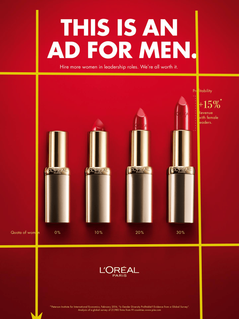
The focus of this Reverse Engineer project is to analyze the use of contrast, repetition, alignment, proximity and color in advertisements. The advertisement used for this analysis was created as part of the 2019 L’oreal ad campaign: “This is an Ad for Men”.
Participants of theCampaign:
L’Oreal Paris has teamed up with the advertising agency McCann Worldgroup Deutschland for a new humorous social media campaign standing for female empowerment across the world.
McCann wrote: “ McCann created print ads that correct the perception of women leaders as less than men. To add a dose of humor, they directed the ads at men. To make them eye-catching, they used actual L’Oreal products to build the info graphics.”
Analysis: Proximity
Proximity
Proximity is used by putting similar related elements together. The lipsticks are together at the same level and clearly resemble the shape of a increasing data graph. Also letters with the equal fonts and sizes are placed together to differentiate the title, facts, and the brand logo from each other.
Analysis: Alignment
Alignment
The elements in this ad have clearly been placed carefully in different areas to guide the viewer, and to define the beginning (at the top) from the end (at the bottom). At the top is the main idea of the campaign, in the middle, the image and facts that explain why «this is and ad for men», then at the end, the brand is located as the author.
Analysis: Repetition
Repetition
Repetition is used to call the audience’s curiosity immediately. Starting with the title elements by being bold with big fonts. Then to quickly emphasize that this is still a women’s product ad, they use 4 big lipsticks. Then to set clearly that this ad is a statistical graph, they use small fonts to present the contribution of women to the business world.
Analysis: Color and Contrast
Color and Contrast
This ad uses gradients with red, and golden colors to represent the brand’s most common hues. Also a dark red color is a statement of excitement, passion, danger, energy, and action; used to also represent what women empowerment means. The contrast between a solid color surface and shiny golden lipsticks helps the audience identify easily the message of the ad and the product it attempts to sell.
Esto es una entrada de muestra, originalmente publicada como parte de Blogging University. Regístrate en uno de nuestros diez programas y empieza tu blog con buen pie.
Hoy vas a publicar una entrada. No te preocupes por el aspecto de tu blog. Tampoco te preocupes si todavía no le has puesto un nombre o si todo esto te agobia un poco. Tan solo haz clic en el botón «Nueva entrada» y explícanos por qué estás aquí.
¿Por qué es necesario?
Porque proporciona contexto a los nuevos lectores. ¿A qué te dedicas? ¿Por qué deberían leer tu blog?
Porque te ayudará a concentrarte en tus propias ideas sobre tu blog y en lo que quieres hacer con él.
La entrada puede ser corta o larga, una introducción de tu vida o una declaración de los objetivos del blog, un manifiesto de cara al futuro o una breve descripción del tipo de cosas que pretendes publicar.
Te ofrecemos algunos consejos útiles para ayudarte a empezar:
¿Por qué publicas tus entradas en lugar de escribir en un diario personal?
¿Sobre qué temas crees que escribirás?
¿Con quién te gustaría conectar a través de tu blog?
Si tu blog resulta ser un éxito a lo largo del próximo año, ¿qué objetivo te gustaría lograr?
No tienes por qué atarte a las decisiones que tomes ahora. Lo bueno de los blogs es que evolucionan constantemente a medida que aprendemos nuevas cosas, crecemos e interactuamos los unos con los otros. Pero está bien saber dónde y por qué empezaste, y plasmar tus objetivos puede darte más ideas para las entradas que quieres publicar.
¿No sabes por dónde empezar? Tan solo escribe lo primero que se te ocurra. Anne Lamott, autora de un libro sobre cómo escribir que nos encanta, afirma que debemos permitirnos escribir un «primer borrador de mierda». Anne está en lo cierto: tan solo tienes que empezar a escribir, y ya te encargarás de editarlo más tarde.
Cuando todo esté listo para publicarse, asigna entre tres y cinco etiquetas a la entrada que describan el centro de atención de tu blog: escritura, fotografía, ficción, educación, comida, coches, películas, deportes… ¡Lo que sea! Estas etiquetas ayudarán a los usuarios interesados en tus temas a encontrarte en el Lector. Una de las etiquetas debe ser «zerotohero», para que los nuevos blogueros también puedan encontrarte.




 The best Insights of Design